Dashboard navigation

Dashboard navigation
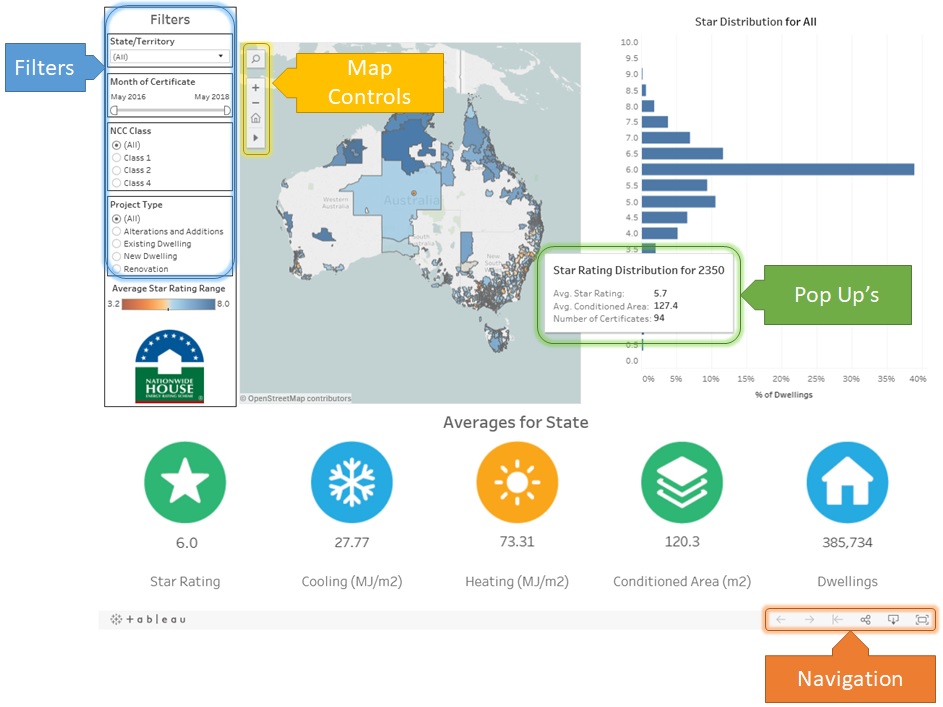
Each dashboard has similar navigation and control settings to allow you to fully explore the data that is presented. The image below shows a typical dashboard with the four main navigation and control functions highlighted. These are:
- Filters
- Navigation
- Pop Up’s
- Map Controls
Filters
Filters appear on each dashboard and allow you to refine the dashboard to a specific subset of data. The filters are arranged into several main sections. These are:
- Geospatial filter – Usually a specific location, such as a state or territory, a climate zone or a local government area (LGA).
- A time period – A time period for the certificates. It is usually arranged with a starting and ending month and year using a slider. Some dashboards use a year only as their filter
- NCC Class – The NCC class of the certificates.
- Project Type – The project type as described on the Universal Certificate. New dwellings, existing dwellings or renovations.
Some dashboards may have additional filters that are specific to that dashboard.
Navigation and Sharing

Navigation controls
Navigation controls are found in the bottom right hand corner of each dashboard. There are three navigation controls which are:
- Back arrow – Goes back one step
- Forward arrow – Redoes the last step
- Reset arrow – Resets the dashboard to its original/default settings.
There are two sharing controls that allow you to copy the URL for this dashboard or copy the embed code for this dashboard, allowing you to embed this dashboard into your own website. You can also download an image or pdf of the dashboard and export images to PowerPoint, but you cannot download the underlying data. This functionality has been disabled on all dashboards.
You can also set the dashboard to display in full screen mode for presentation purposes. To return to the normal view press the Esc key on your keyboard.
Map Controls

Map navigation buttons
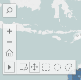
Several dashboards use maps to visualise data. Some of the maps have their own controls. These controls include:
- Magnify glass – Allows you to enter a search criteria, such as, place name, postcode or local government area. Once entered the map will zoom to and highlight that area.
- + and – – Zoom in and out controls
- Home icon – Will reset the map to its default location based on the filters selected.
- > – Select option, including zoom to an area, pan, rectangular select, radial select (which includes distance from centre point), lasso select.
Pop Up’s

Pop-up overlays
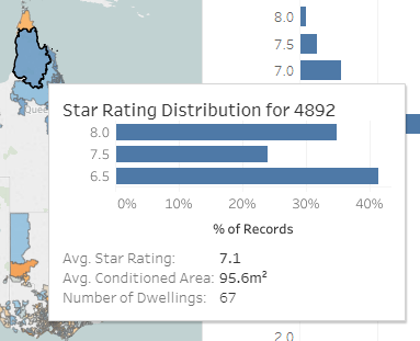
Hovering over many of the visualisations will trigger a pop up window to be displayed. This pop up will display additional information about that particular data point or region. Some pop ups also contain their own data visualisation, such as a histogram.
